


- 엘리먼트의 위치와 크기
<!DOCTYPE html>
<html lang="en">
<head>
    <meta charset="UTF-8">
    <meta name="viewport" content="width=device-width, initial-scale=1.0">
    <title>문서의 기하학적 특성</title>
    <style>
        body{
            padding:0;
            margin:0;
        }
        #target{
            width:100px;
            height:100px;
            border:50px solid #1065e6;
            padding:50px;
            margin:50px;
        }
    </style>
</head>
<body>
    <div id="target">
        Coding
    </div>
    <script>
        let t =document.getElementById('target')
        console.log(t.getBoundingClientRect())
    </script>
</body>
</html>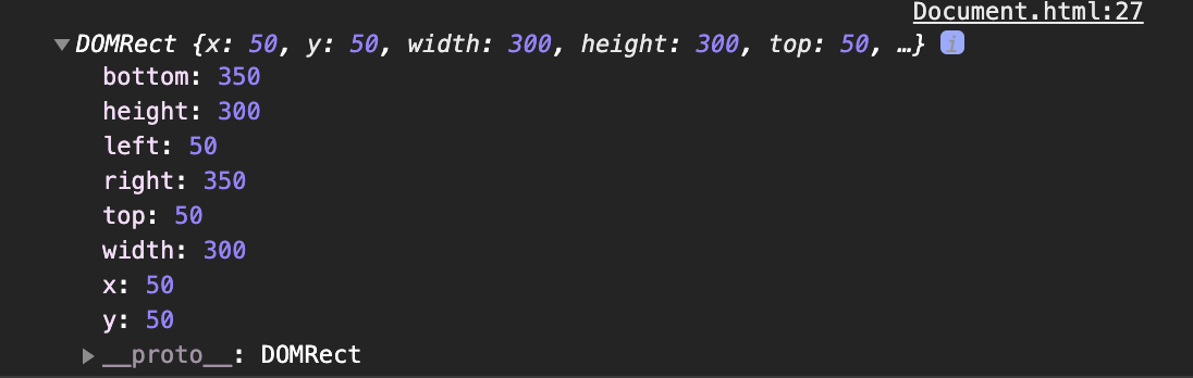
엘리먼트의 테두리와 body태그 사이의 거리가 50px이다. 그리고 테두리를 포함한 엘리먼트의 크기는 300px이다. 이 값을 알아내고 싶을 때 사용하는 API가 getBoundingClientRect이다.
<!DOCTYPE html>
<html lang="en">
<head>
    <meta charset="UTF-8">
    <meta name="viewport" content="width=device-width, initial-scale=1.0">
    <title>문서의 기하학적 특성</title>

</head>
<body>
    <style>
        body{
            padding:0;
            margin:0;
        }
        div{
            border:50px solid #1065e6;
            padding: 50px;
            margin: 50px;
        }
        #target{
            width:100px;
            height:100px;
        }
    </style>

    <div>
        <div id="target">
            Coding
        </div>
    </div>
    <script>
        let t =document.getElementById('target')
        //console.log(t.getBoundingClientRect())
        console.log(t.getBoundingClientRect())
        console.log(t.offsetParent)
    </script>

</body>
</html>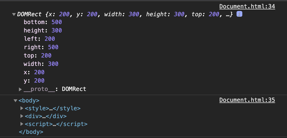
엘리먼트의 위치를 의미하는 top, right값을 통해서 기준이 그 부모가 아니라 body 태그라는 것을 알 수 있다. 그리고 이를 명시적으로 확인할 수 있는 방법은 offsetParent 속성을 호출하는 것이다. 만약 부모 가운데 CSS position의 값이 static인 td, th, table 엘리먼트가 있다면 이 엘리먼트가 offsetParent가 된다. 그리고 테두리를 제외한 엘리먼트의 크기를 알고 싶다면 ClientWidth, ClientHeight를 사용한다.
- Viewport
<body>
    <style>
        body{
            padding: 0;
            margin: 0;
        }
        div{
            border:50px solid #1065e6;
            padding:50px;
            margin:50px;
        }
        #target{
            width:100px;
            height: 2000px;
        }
    </style>
    <table>
        <tr></td>
            <div>
                <div id="target">
                    Coding
                </div>
            </div>
        </table>

        <script>
            let t = document.getElementById('target')
            setInterval(function(){ //setInterval -> 함수부분을 1초에 한번씩 반복적으로 호출하는 함수.
                console.log('getBoundingClientRect :', t.getBoundingClientRect().top, 'pageYOffset: ',window.pageYOffset)
            },1000)
        </script>
</body>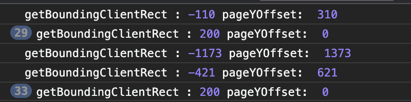
getBoundingClientRect는 Viewport에서부터 엘리먼트와의 거리를 알려준다. Viewport와 pageYOffset의 값을 더하면 그 문서의 엘리먼트가 바디와 바디 엘리먼트 사이의 거리를 알아낼 수 있다.
- 스크롤 제어
<input type="button" id="scrollBtn" value ="scroll(0,1000)"/>
        <script>
            document.getElementById('scrollBtn').addEventListener('click', ()=>{
                window.scrollTo(0,1000) # 0 = x, 1000 = y 1000만큼 y축으로 스크롤 이동.
})- 스크린 크기
<script>
console.log('window.innerWidth:', window.innerWidth, 'window.innerHeight:', window.innerHeight)
console.log('screen.width:', screen.width ,'screen.height:', screen.height)
</script>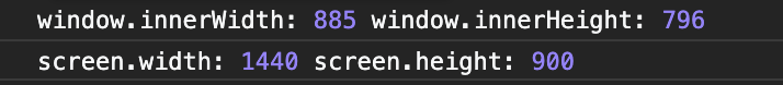
window.innerWidth와 window.innerHeight 는 Viewport 상 에서의 높이와 폭을 의미하는 것이다 . screen.width와 screen.height는 현재 사용자가 사용하고 있는 PC의 화면 해상도를 나타내는 것이다. 이것을 활용해서 다양한 사용자들의 화면 해상도에 맞게 웹을 제작하는데 활용할 수 있다고 한다.
'개발' 카테고리의 다른 글
| [Javascript] 이벤트 - 2 (0) | 2020.12.31 |
|---|---|
| [Javascript] 이벤트 (0) | 2020.12.30 |
| [Javascript] Node 객체 (0) | 2020.12.22 |
| [Javascript] Element (0) | 2020.12.21 |
| CSS 공부 - 5 (0) | 2020.12.10 |